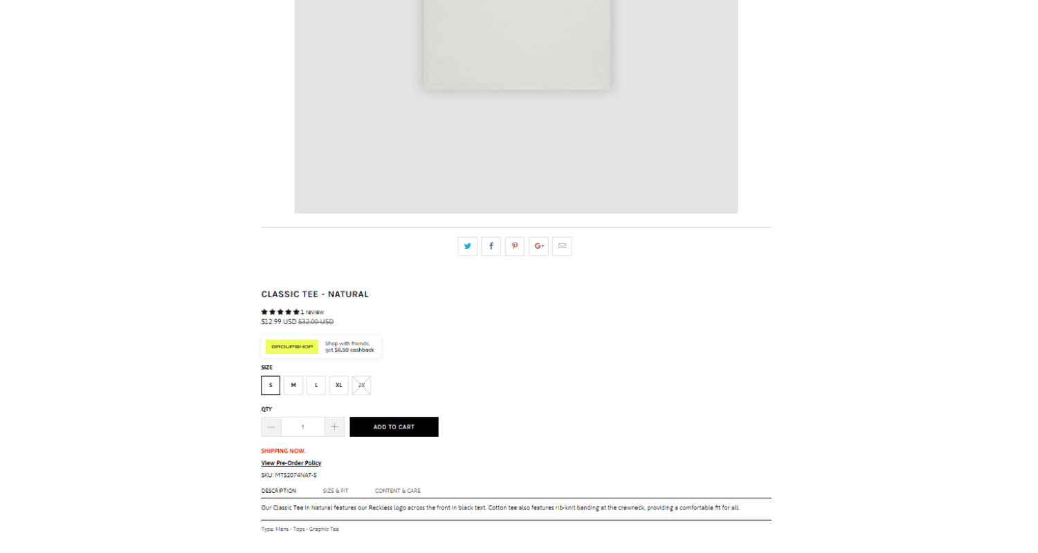
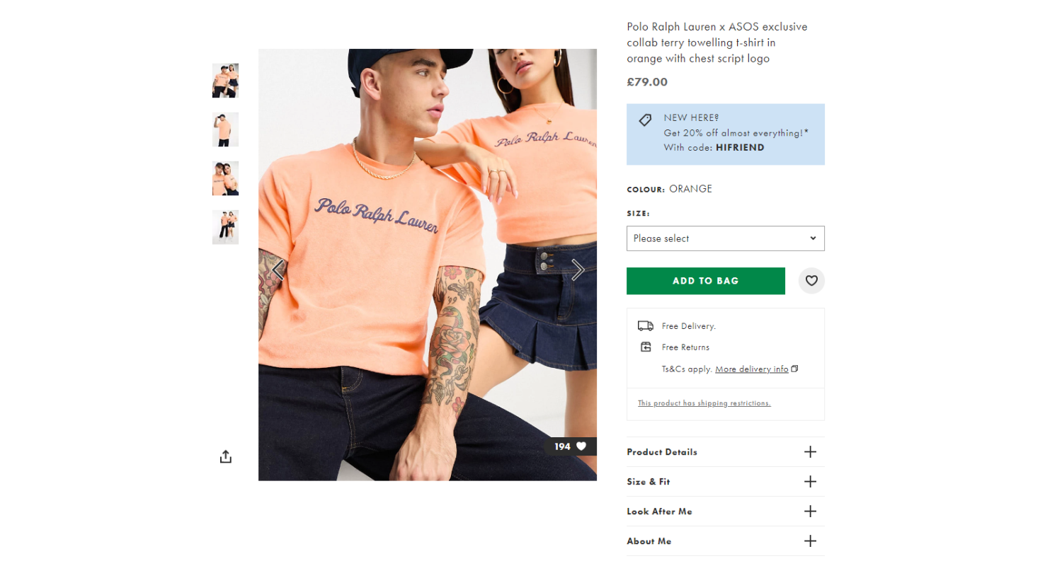
1. Do you use standard product page layout? (gallery on the left and overview on the right)
Your webstore users are used to a standard layout of product pages that most stores use.
Therefore, you should follow this layout, to decrease cognitive load on your shoppers and make the shopping experience easier.
To follow the standard layout, on wide screens your product gallery should be placed on the left-hand side, and product overview (price, variants, CTA-button), should be placed on the right-hand side. Then you should show the product description, recommended products, customer reviews and an email form if a newsletter is available.
Mobile product page standard layout:
1. Breadcrumbs
2. Gallery
3. Sale sticker (when relevant)
4. Product title
5. Product review rating with stars (or other types of symbols relevant to your community)
6. Price & old price crossed-out
7. Product variants (if available)
8. Quantity selectors with buttons
9. ATC or buy now button
10. Product description
11. Recommended Products
12. All product’s customer reviews and the option to leave yours
13. Email form (highly recommended, if a newsletter is available. Show above the footer)
Highly converting product page example (full):


The most crucial page on your store is your product page.
If you properly construct your product page, you will see increased revenue.
If you do the opposite, any marketing efforts will fall short of expectations.
That's why you need to concentrate your design work on product page optimization.
